How to Quickly Plot Data with Python on your Computer
Here’s a quick tutorial on plotting data with python on your computer. Python is one of the easiest ways to plot and visualize data.


Here’s a quick tutorial on plotting data with python on your computer. Python is one of the easiest ways to plot and visualize data.
Recently, I had some data I wanted to examine and plot quickly. My mind quickly jumped to Python as an easy way to explore the data and chart areas of interest.
While it is easy to play with python in a web kernel (DataCamp / CodeAcademy/Kaggle), I wanted to be able to chart them on my computer. After searching for a few tutorials, I realized the information to do this is scattered across the internet.
1. Installing Python
The first part of the process is to install Python and the required dependencies on your computer.
Easy Way – Anaconda

The easiest way to install Python is by installing the Anaconda Framework for Data Science. This works for both MacOSX, Windows, and Linux.
https://www.anaconda.com/distribution/

You can download either installing Python 3 or Python 2 version. I personally recommend installing Python 3.
Once the download is completed, you can launch the package installer and complete the installation.


Hard Way – HomeBrew (MacOSX)
MacOSX
1. Check your python version
$ python --version
Python 2.7.3 :: Continuum Analytics, Inc.
2. Install Xcode
To properly run Hombrew on your Mac, you need to install Xcode as a dependency.
Option A
$ xcode-select --installOption B
Go to the App Store and Install Xcode.

3. Install Homebrew
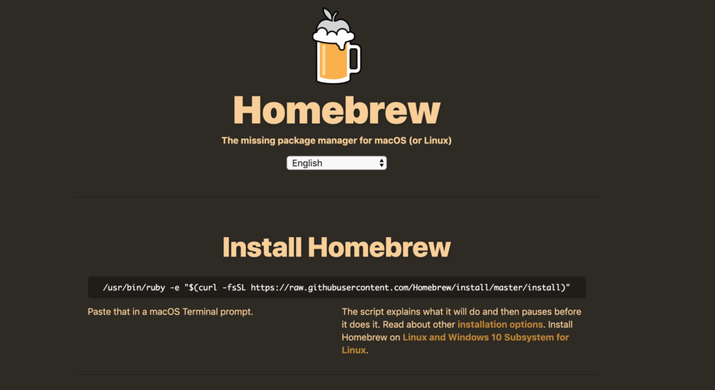
In your Terminal paste the following command:
$ /usr/bin/ruby -e "$(curl -fsSL https://raw.githubusercontent.com/Homebrew/install/master/install)"
To verify that the installation worked as expected, type the following command:
$ brew doctor
Your system is ready to brew.
4. Installing Python
To install Python, you call the brew command in your Terminal. You can install other packages besides python using brew.
$ brew install python3 Once you have successfully installed python3, you can check the version to verify that the installation was successful.
$ python3 --versionTo start a Python session type in:
$ python32. Selecting your Editing Experience
For the rest of this tutorial, I’m going to assume you installed the Anaconda Package.
1. Start Anaconda Navigator
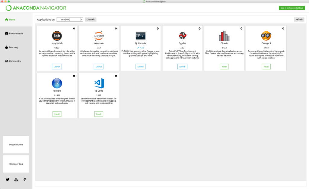
There are a couple of options in the Anaconda Navigator. Jupyter Notebook is the most common one which provides a great framework to do data analysis and annotate your steps along the way.
For this tutorial, we are going to use Spyder which provides an IDE like experience to quickly iterate on our analysis. This is similar to R Studio or MATLAB.
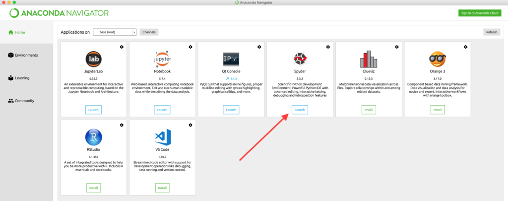
2. Launch Spyder
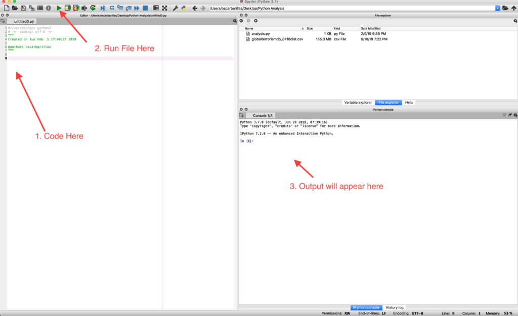
3. Importing your Data
First, we want to add the required dependencies to read and plot data. We will import Pandas, NumPy, Matplolib, and Seaborn into our Python file.
# Import Required Python Dependencies
import pandas as pd
import numpy as np
import matplotlib.pyplot as plt
import seaborn as sns
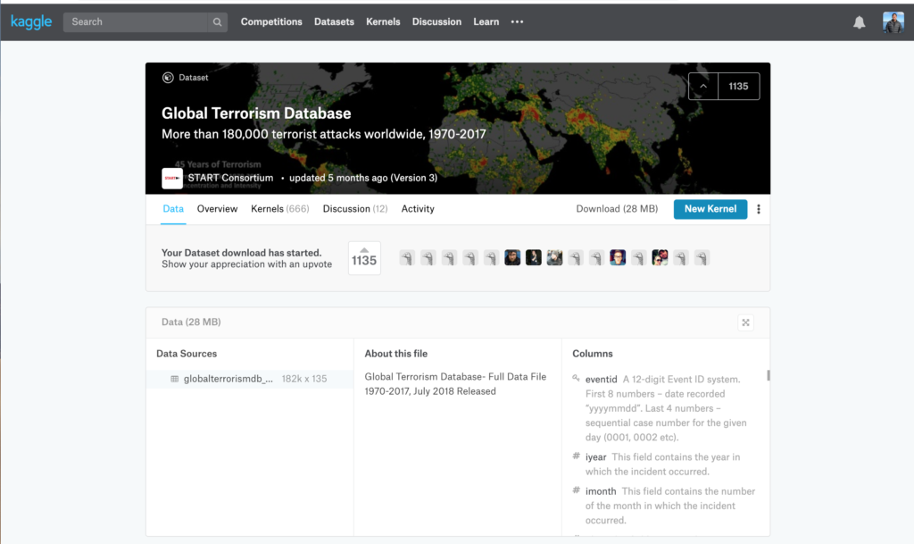
Next, we are going to import the file you want to analyze. For the purpose of this exercise, we are going to use sample data from Kaggle. Kaggle is a great place where you can download and use different data sets to explore trends or practice your data science skills.
We will import this file into Pandas so we can easily plot the DataFrame using Pandas and Seaborn.
To add a file to a Pandas DataFrame, you can use the pd.read_csv() command. We will also clean up our data to make it more readable and cut off parts we don’t want to analyze.
# Read in the file
terror= pd.read_csv('globalterrorismdb_0718dist.csv', encoding='ISO-8859-1', low_memory = False)

# Rename Columns for better readability
terror.rename(columns={'iyear':'Year','imonth':'Month','iday':'Day','country_txt':'Country','region_txt':'Region','attacktype1_txt':'AttackType','target1':'Target','nkill':'Killed','nwound':'Wounded','summary':'Summary','gname':'Group','targtype1_txt':'Target_type','weaptype1_txt':'Weapon_type','motive':'Motive'},inplace=True)

# Select columns we are most interested in analyzing
terror=terror[['Year','Month','Day','Country','Region','city','latitude','longitude','AttackType','Killed','Wounded','Target','Summary','Group','Target_type','Weapon_type','Motive']]

# Calculate the casualties (Both Killed + Wounded)
terror['casualties']=terror['Killed']+terror['Wounded']

print(terror.head(4))
Output:
   Year  Month  Day    ...     Weapon_type Motive casualties
0  1970      7    2    ...         Unknown    NaN        1.0
1  1970      0    0    ...         Unknown    NaN        0.0
2  1970      1    0    ...         Unknown    NaN        1.0
3  1970      1    0    ...      Explosives    NaN        NaN
Lastly, we are going to print out some descriptive information about the
4. Charting your Data
Using Seaborn, we can plot some areas of interest. For this exercise, I will plot two simple visualizations of the data.
Terrorist Activities Each Year
plt.style.use('fivethirtyeight')

# Using Seaborn we can plot the Terrorist attacks by Year
plt.subplots(figsize=(15,6))
sns.countplot('Year',data=terror,palette='RdYlGn_r',edgecolor=sns.color_palette('dark',7))
plt.xticks(rotation=90)
plt.title('Number Of Terrorist Activities Each Year')
plt.show()
Attack Methods by Terrorists
# We can also plot the Attack Methods by Terorrists
plt.subplots(figsize=(15,6))
sns.countplot('AttackType',data=terror,palette='inferno',order=terror['AttackType'].value_counts().index)
plt.xticks(rotation=90)
plt.title('Attacking Methods by Terrorists')
plt.show()
Full Code Block

#!/usr/bin/env python3
# -*- coding: utf-8 -*-
"""
Created on Tue Feb  5 16:55:13 2019

@author: oscarbarillas
"""

# Import Required Python Dependencies
import pandas as pd
import numpy as np
import matplotlib.pyplot as plt
import seaborn as sns

# Read in the file
terror= pd.read_csv('globalterrorismdb_0718dist.csv', encoding='ISO-8859-1', low_memory = False)

# Rename Columns for better readability
terror.rename(columns={'iyear':'Year','imonth':'Month','iday':'Day','country_txt':'Country','region_txt':'Region','attacktype1_txt':'AttackType','target1':'Target','nkill':'Killed','nwound':'Wounded','summary':'Summary','gname':'Group','targtype1_txt':'Target_type','weaptype1_txt':'Weapon_type','motive':'Motive'},inplace=True)

# Select columns we are most interested in analyzing
terror=terror[['Year','Month','Day','Country','Region','city','latitude','longitude','AttackType','Killed','Wounded','Target','Summary','Group','Target_type','Weapon_type','Motive']]

# Calculate the casualties (Both Killed + Wounded)
terror['casualties']=terror['Killed']+terror['Wounded']

print(terror.head(4))


plt.style.use('fivethirtyeight')

# Using Seaborn we can plot the Terrorist attacks by Year

plt.subplots(figsize=(15,6))
sns.countplot('Year',data=terror,palette='RdYlGn_r',edgecolor=sns.color_palette('dark',7))
plt.xticks(rotation=90)
plt.title('Number Of Terrorist Activities Each Year')
plt.show()


# We can also plot the Attack Methods by Terorrists
plt.subplots(figsize=(15,6))
sns.countplot('AttackType',data=terror,palette='inferno',order=terror['AttackType'].value_counts().index)
plt.xticks(rotation=90)
plt.title('Attacking Methods by Terrorists')
plt.show()
Attributions
- https://www.kaggle.com/ash316/terrorism-around-the-world
- The majority of the charting for this dataset was taken from this very comprehensive kernel from Kaggle. If you are interested in exploring more, this kernel will provide further analysis of the Terrorism dataset.